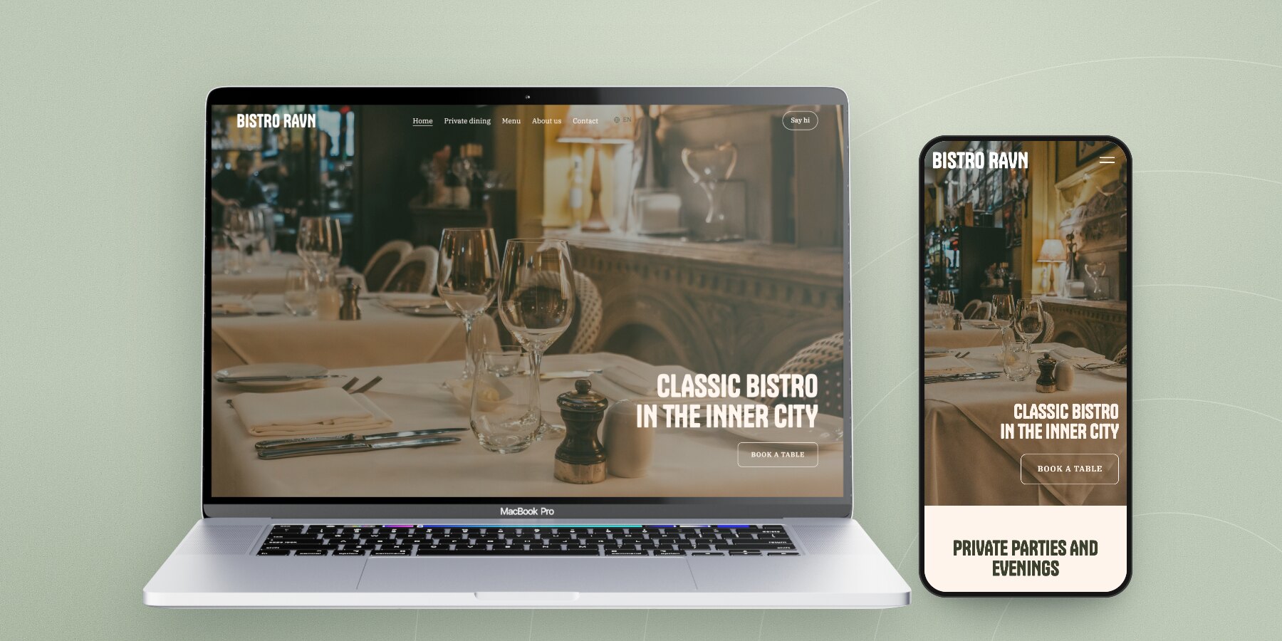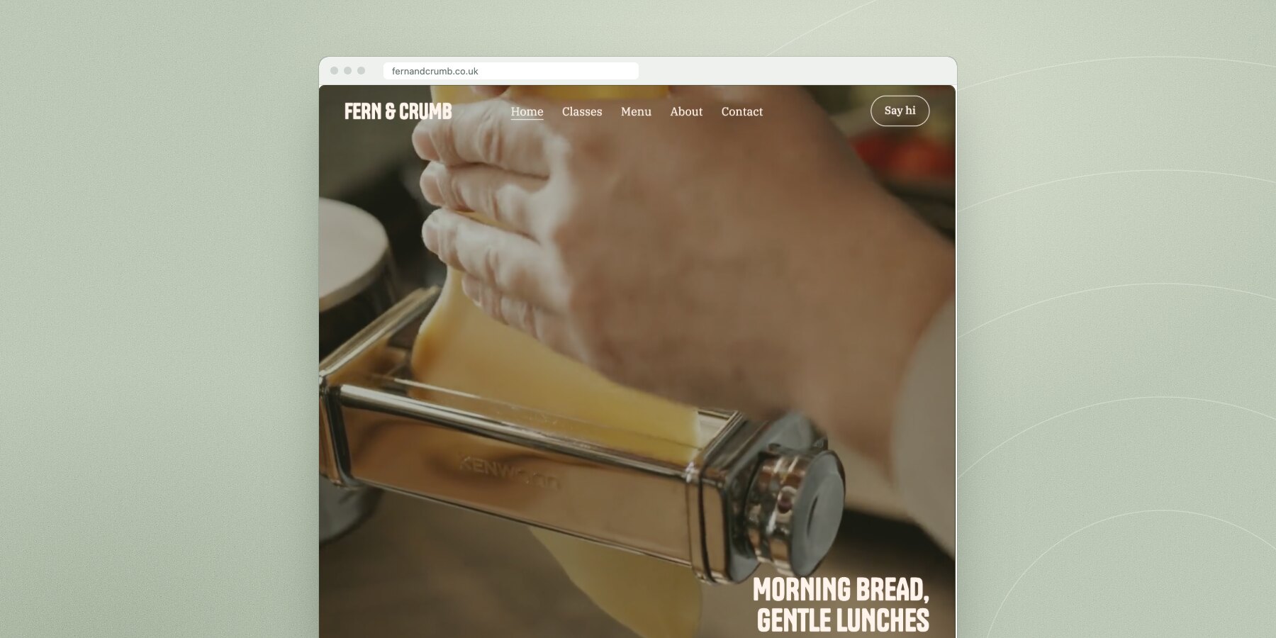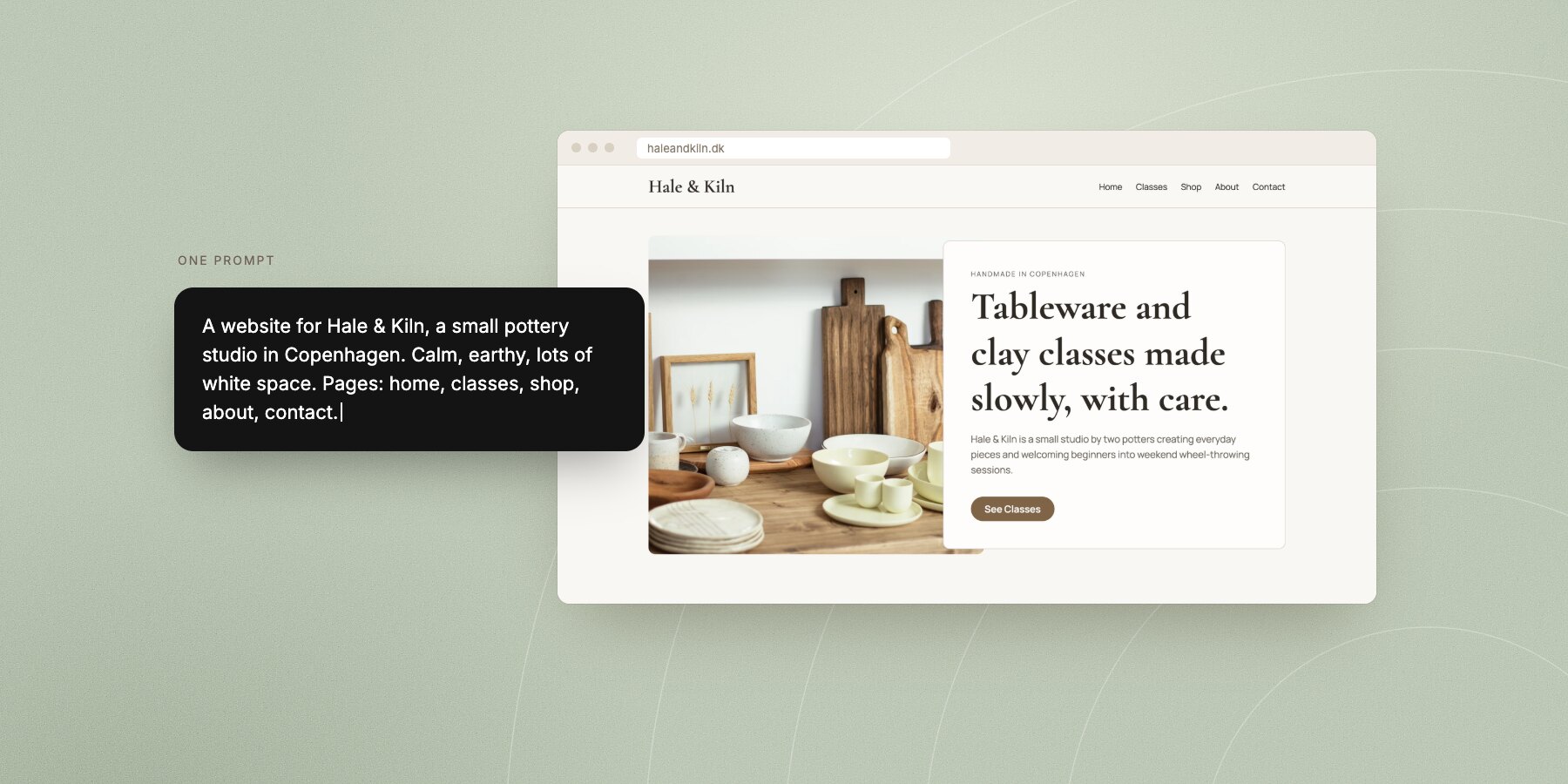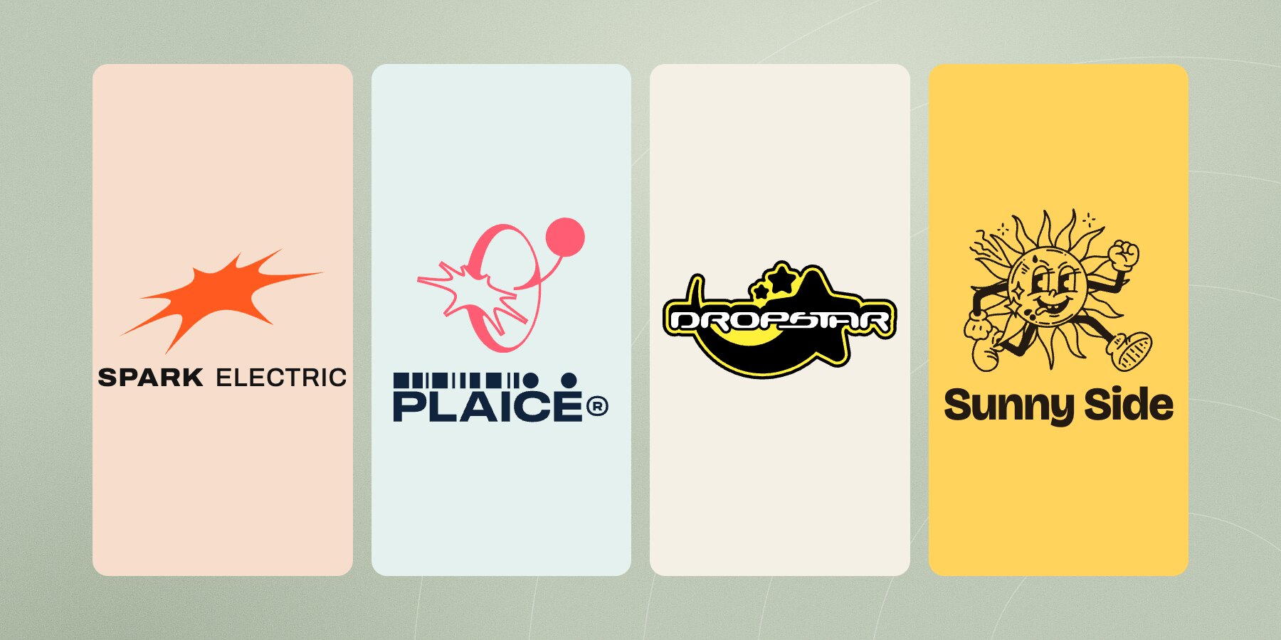
Short answer: A good logo for a small business is simple enough to recognise at the size of a browser tab and clear enough to say who you are on a shop sign. Pick one of five kinds (a wordmark, a symbol, a combination of the two, a badge or a mascot), keep it to one or two colours, and make three versions of it: a wide one, a square one and a tiny one.
Most people start by looking for a clever idea. It's usually the wrong place to start. A logo's first job is to be recognised, and that happens through repetition, not cleverness. The logo you use everywhere for three years will do more than the perfect one you never finish.
Below, made-up businesses show the five kinds of logo, and what happens to each one when it has to work small.
The five kinds of logo
A wordmark: just the name, set well
The simplest logo there is, and often the best. Your name in a typeface that suits you, maybe with one detail picked out in colour. People learn your name while they learn your logo, because they're the same thing.
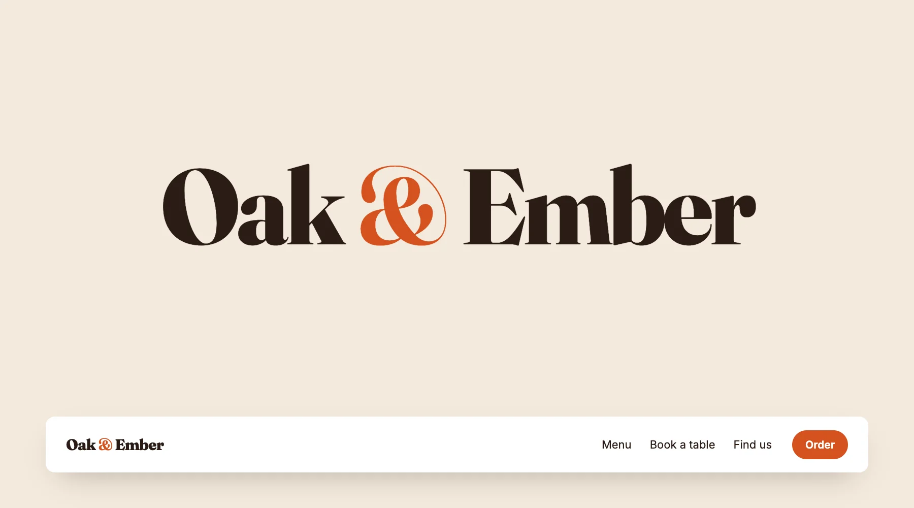
A wordmark suits most restaurants, shops, salons and consultants, and it's the right choice when your name is short. It struggles when the name is long, or when you need something square for a social profile.
A symbol: a shape people come to know
A symbol is a mark that stands on its own, usually next to the name. It takes longer for people to connect it with you, but once they do, you can use it anywhere: on a sticker, a membership card, a profile picture.
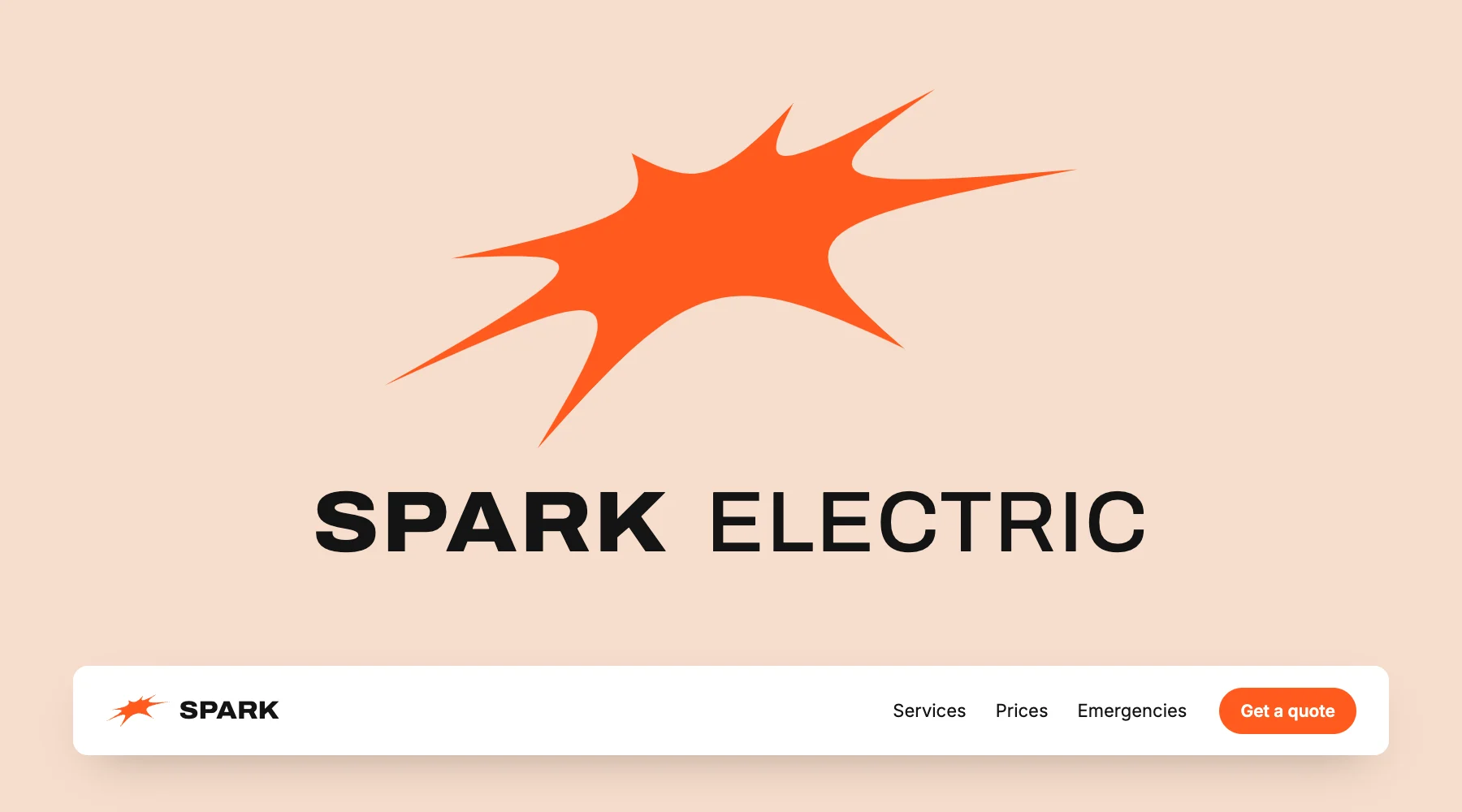
Keep the symbol simple enough to draw from memory. If you need to explain it, it's doing too much.
A combination mark: symbol and name together
Most logos you know are really this: a symbol and a wordmark designed to sit side by side. You get the recognition of a symbol and the clarity of a name, and you can split them up when space is tight.
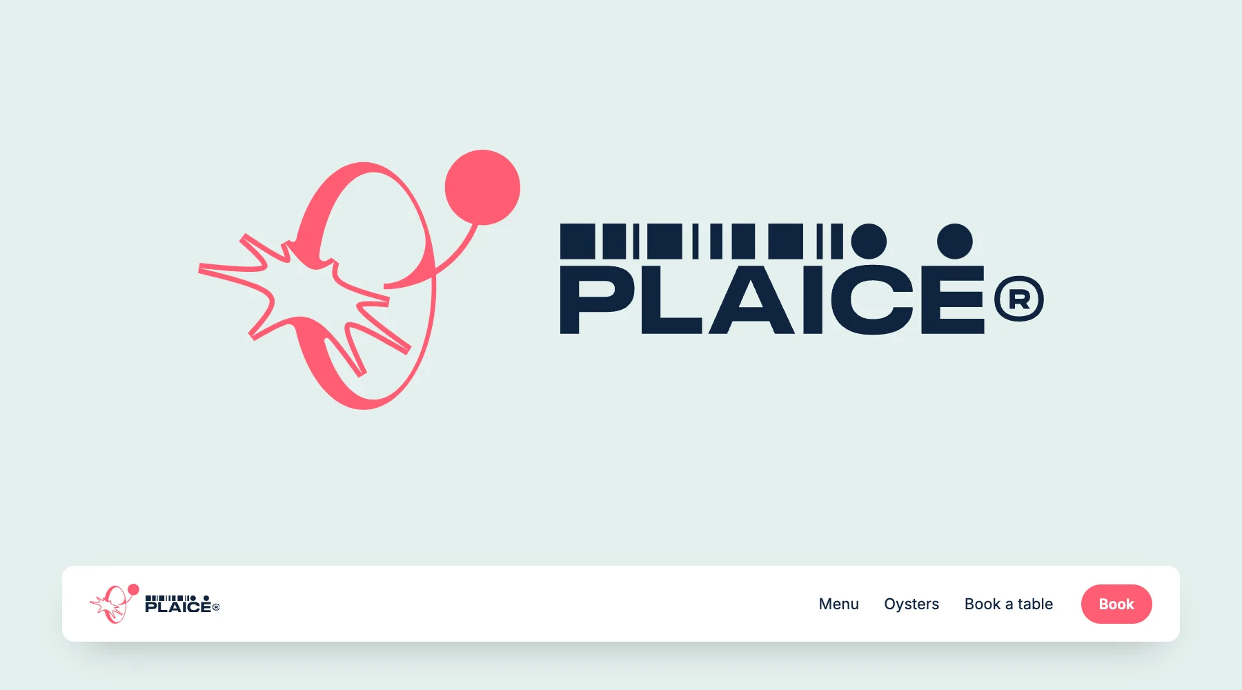
If you're unsure which kind to choose, this is the safe one. Just make sure each half works on its own.
A badge: the name inside a shape
Badges are the name and a symbol locked together in a circle or a crest. They feel like a sticker or a patch, which is why record shops, breweries, barbers and skate shops love them.
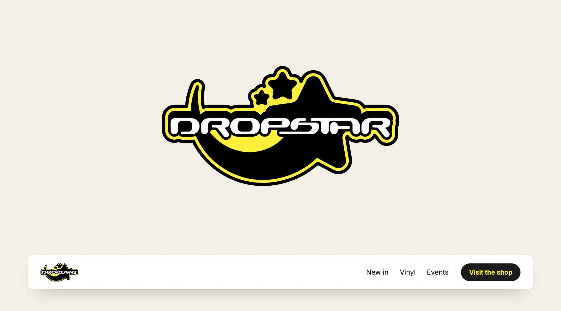
That's the catch. A badge needs room. If you choose one, give it a simpler partner for small spaces: one element from it on its own, or just the name.
A mascot: a character with a personality
A mascot gives the business a face. It's the most memorable kind of logo, and the one that sets the tone most clearly. Nobody expects a cartoon sun to be serious.
Mascots work for cafés, kids' activities, food brands and anything that wants to be approachable. They're a poor fit for a law firm, and they need the same small-size partner as a badge.
How to choose
- Short name and not much time? Start with a wordmark. You can always add a symbol later.
- Your logo will live on stickers, cards and profile pictures? You need a symbol, or at least a square version of your name.
- You want both recognition and a clear name? A combination mark.
- You want to feel like a sticker on a guitar case? A badge, with a simple partner for small spaces.
- Your business is about mood more than precision? A mascot.
Shrink your idea to the size of a thumbnail before you fall for it. If you can't tell what it is at that size, most people won't.
One logo, three versions
A logo isn't one file. You need a wide version for your website header, a square one for social profiles and app tiles, and a tiny one for the browser tab. They should look like the same family, but they don't have to be identical.
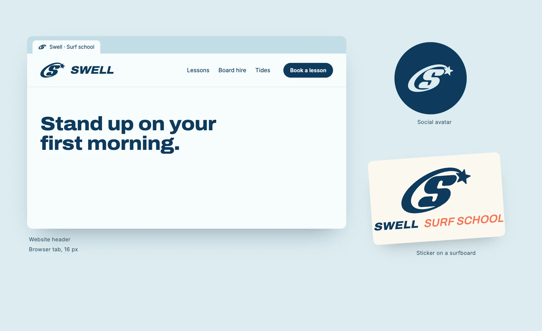
Keep it to one or two colours and one typeface. A logo that only works in full colour on white will let you down on a dark photo, on a stamp or printed in black.
Putting your logo on your website
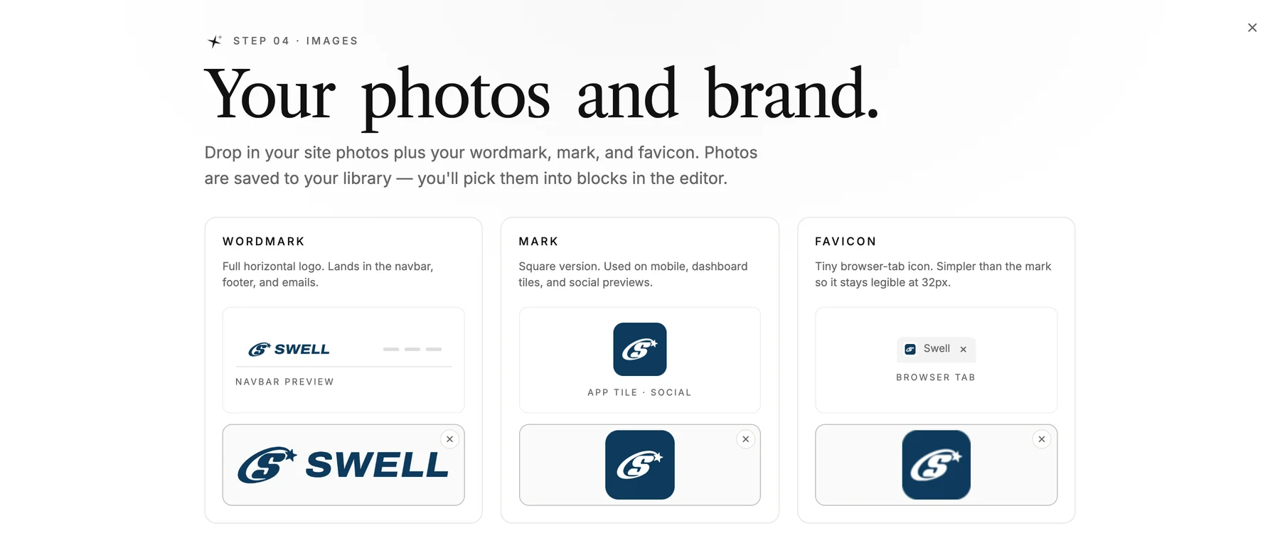
When you set up a site in LINJERUM Studio, the brand step asks for exactly these three versions: the wordmark for the header, footer and emails, the mark for mobile and social previews, and the favicon for the browser tab. Upload SVG or PNG files.
That last point matters. You don't need a finished logo to start your website. A name set in a good typeface is already a wordmark, and it's better than a rushed symbol. Pick a template and add the logo when it's ready.
What to avoid
- Fine details and thin lines that disappear when the logo is small.
- More than two colours. Every extra colour is one more thing that can go wrong in print.
- Trendy effects like gradients and shadows. They date fast and rarely survive a stamp or an embroidered shirt.
- A symbol that needs an explanation.
- Changing it every year. Recognition comes from repetition.
FAQ
How do I make a logo for my business for free?
Start with a wordmark: your name in a good free typeface, such as one from Google Fonts, in one colour. It costs nothing, it's easy to use everywhere, and it's often better than a free logo generator's symbol, which thousands of other businesses are also using.
Can AI make my logo?
AI tools are good for exploring directions quickly. Treat the results as sketches. Check that the final logo works in one colour and at a small size, and make sure you have a clean SVG or PNG file, not just a screenshot.
What file format should my logo be?
SVG for anything on a screen, because it stays sharp at every size. Keep a PNG with a transparent background as a backup, and a square version for social profiles and the browser tab.
Do I need a logo before I make a website?
No. Your name set in a good typeface works as a logo from day one. Build the site, and swap in a real logo when you have one.